Redesigning the Moto app
The Moto app is an important showcase for Motorola to highlight features that let users go beyond the standard Android experience. It not only lets users find gestures, shortcuts, and more, but it also provides easy access to tutorials and other educational content.
The app was first introduced on the Moto X in 2014 and lived through several generations before user research uncovered that users perceived the app as a settings menu, rather than an experience. Users also weren’t discovering many of the features the Moto app was conceived to highlight.
So, the Moto team went to work on a redesign.
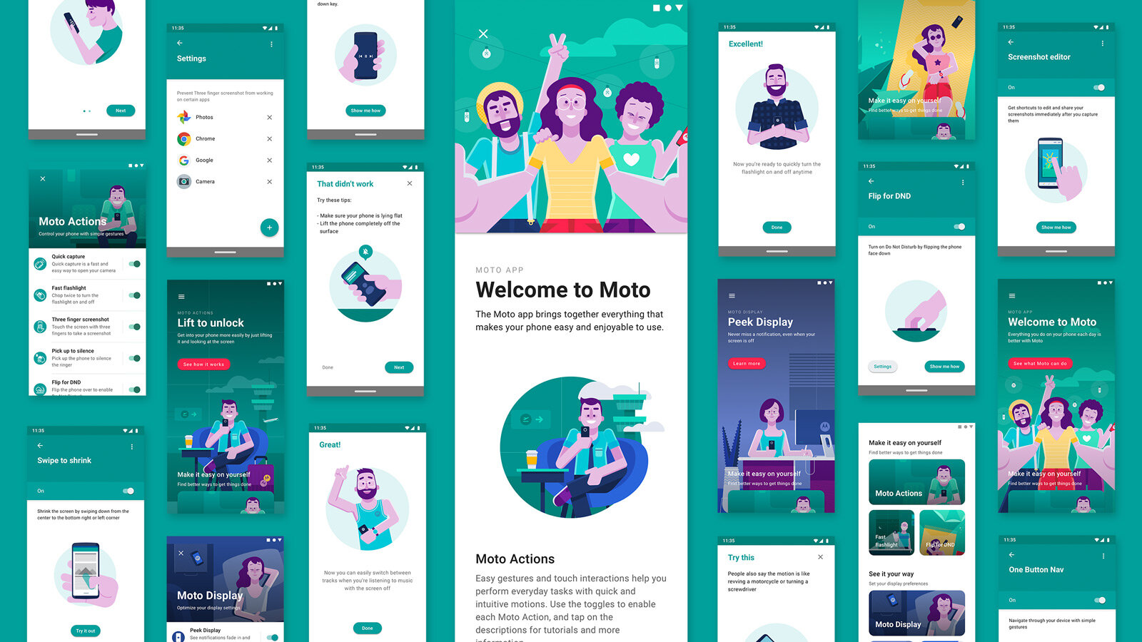
By incorporating vivid illustrations, editorial copy, and card-based navigation, the team integrated Moto’s design language with Material Design components to make the app more approachable, engaging, and educational.
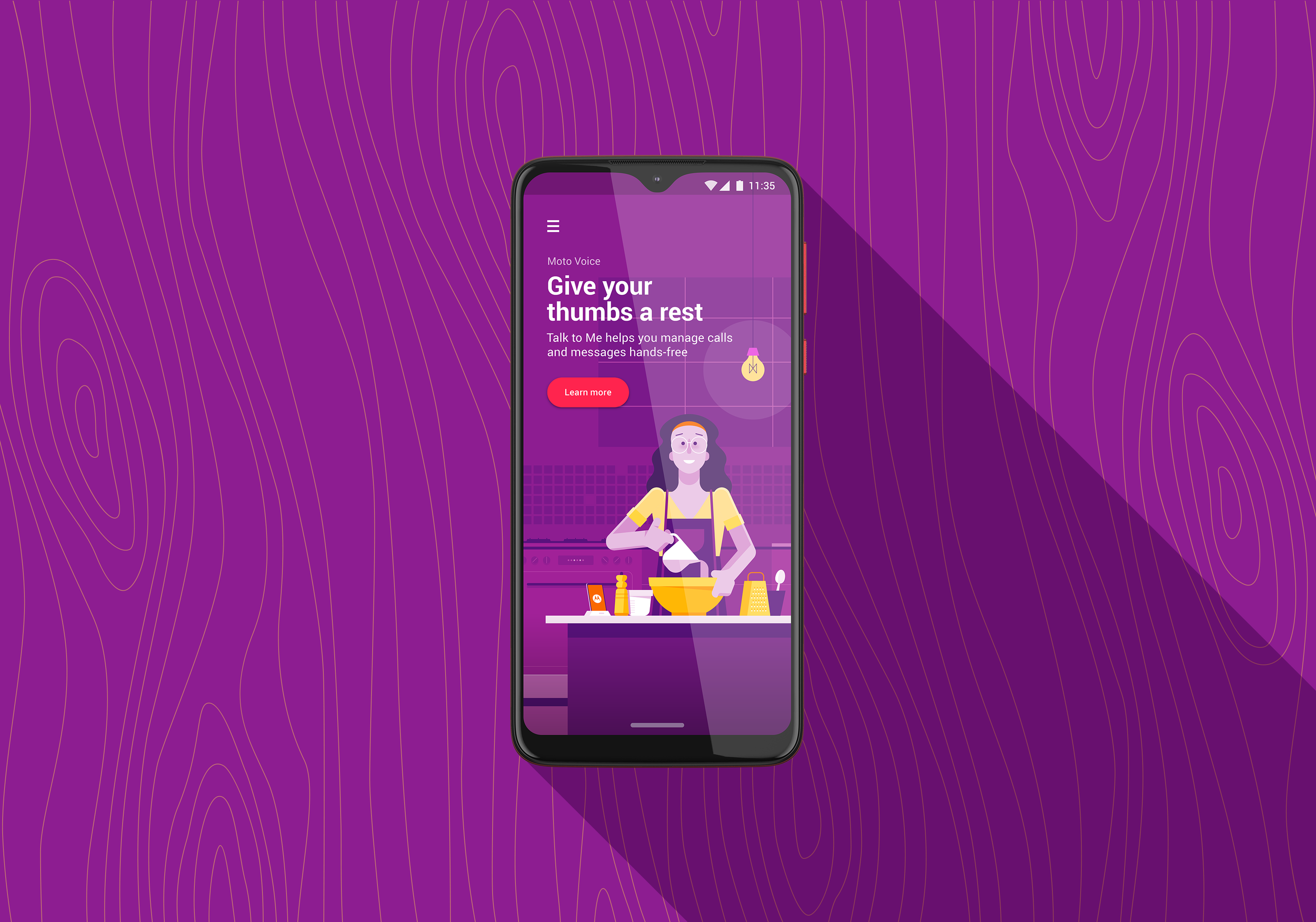
The team addressed feature discoverability in two ways. First, when users enter the app, they’re met with a captivating hero image that highlights a feature. On the hero screen, copy and illustrations work together to communicate the benefits each feature provides, while an action button gives easy access to a tutorial.
New users see randomized hero screens each time they enter the app, and those who’ve been using the app for a while see hero screens based on their usage. If someone hasn’t used a feature in a while, they’ll see that hero card more often.
In addition to the hero screens, tiles in the card-based app menu also expose users to features they haven’t taken advantage of yet. By enhancing discoverability and making features easier to learn about, the Moto app transformed into an immersive experience that users are more likely to visit regularly.
As hoped, engagement has grown since the redesign launched, and research shows many users now see the app as more of an extension of the Motorola brand, rather than a disconnected settings menu.
My perspective
This was the first project at Motorola where I really got to spread my wings and drive the content strategy. The team working on it was a huge reason why the redesign was so successful. It’s a kind, talented, and driven group that knows how to work hard to do what’s right for the user. From high visibility illustrations to minor accessibility adjustments, the team approached every detail with purpose. Creative ideation was more collaborative than it is on most projects, and I learned how valuable a different perspective can be in the creative process.
Awards:
People’s Choice - Brasil Design Awards, 2019
Bronze, App Design - Brasil Design Awards, 2019
Illustration Shortlist - The One Club Awards, 2019
See more about the Moto app on Google Play.
Visuals courtesy of Tim Schavitz and Cezar Bianchi.


